Project Overview
A dashboard design that helped close deals in 2020, and is still in the product six years later.
Overview
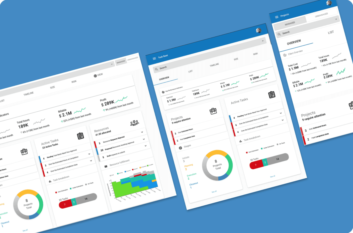
In 2020, Replicon needed an analytics dashboard that could make sense of project data and everything that was connected to it. This predates my AI work. I'm keeping it here because it shows the systems thinking that everything above is built on.
The problem
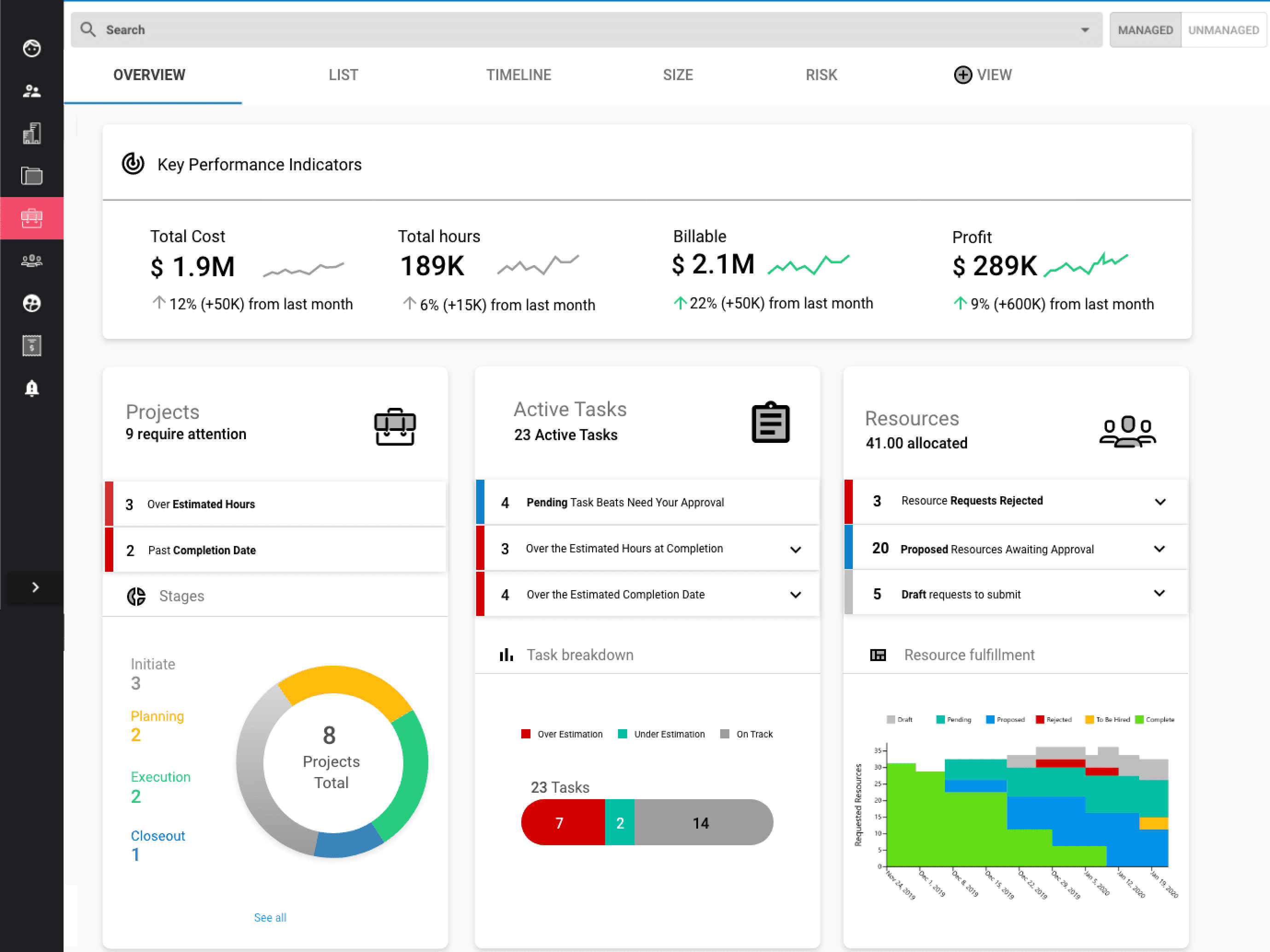
Too much data, no hierarchy. We had a list page of all the projects, but for Project Managers overseeing multiple projects at a time, it was unclear about priorities and a big picture of how they were doing.
Key decisions
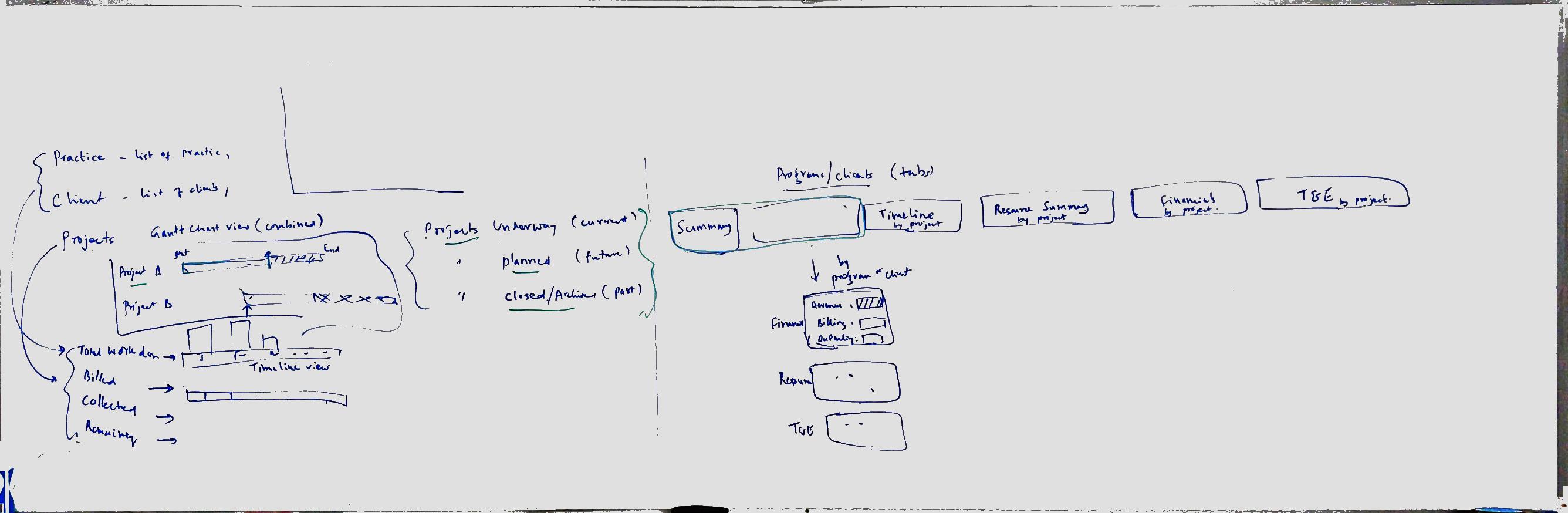
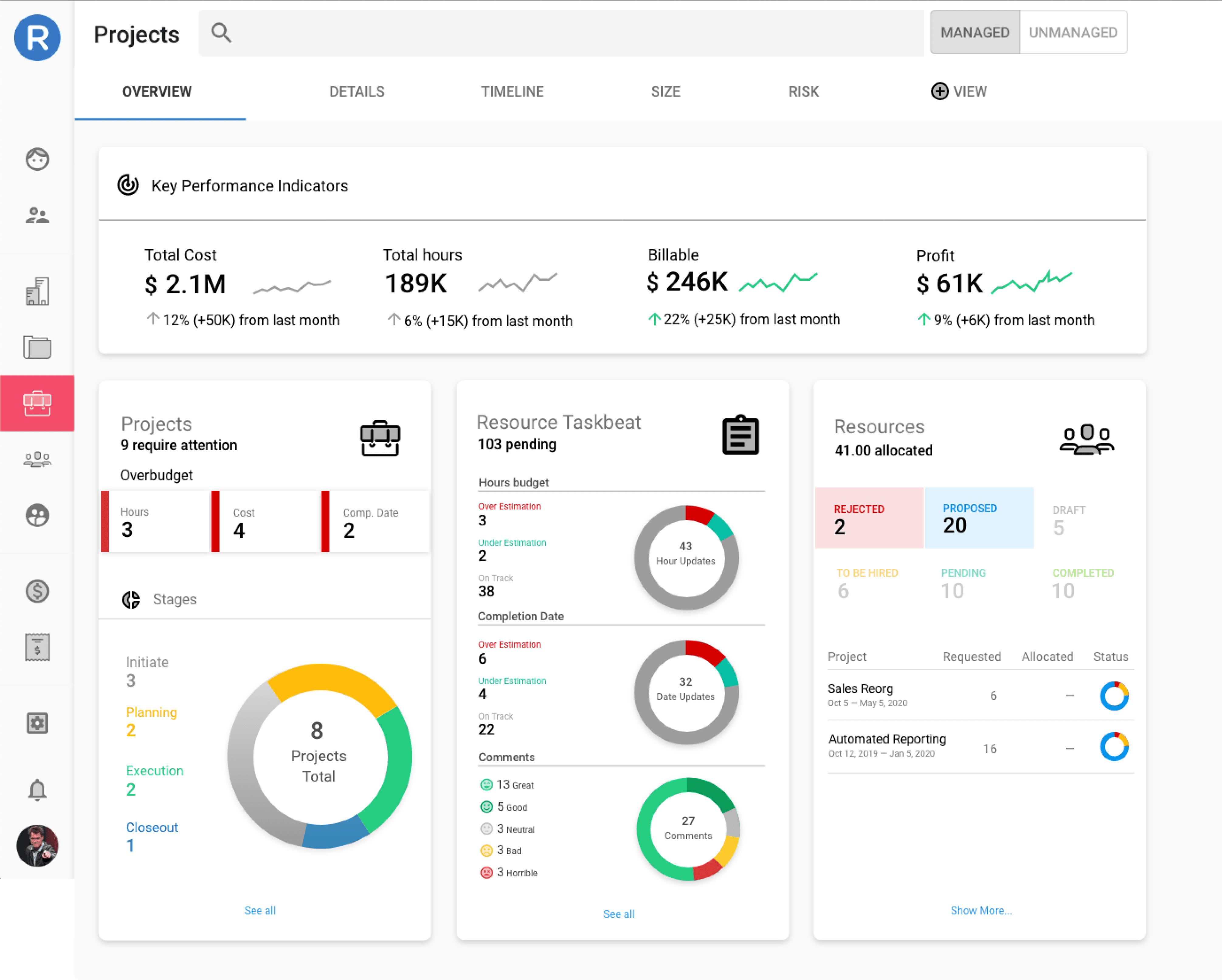
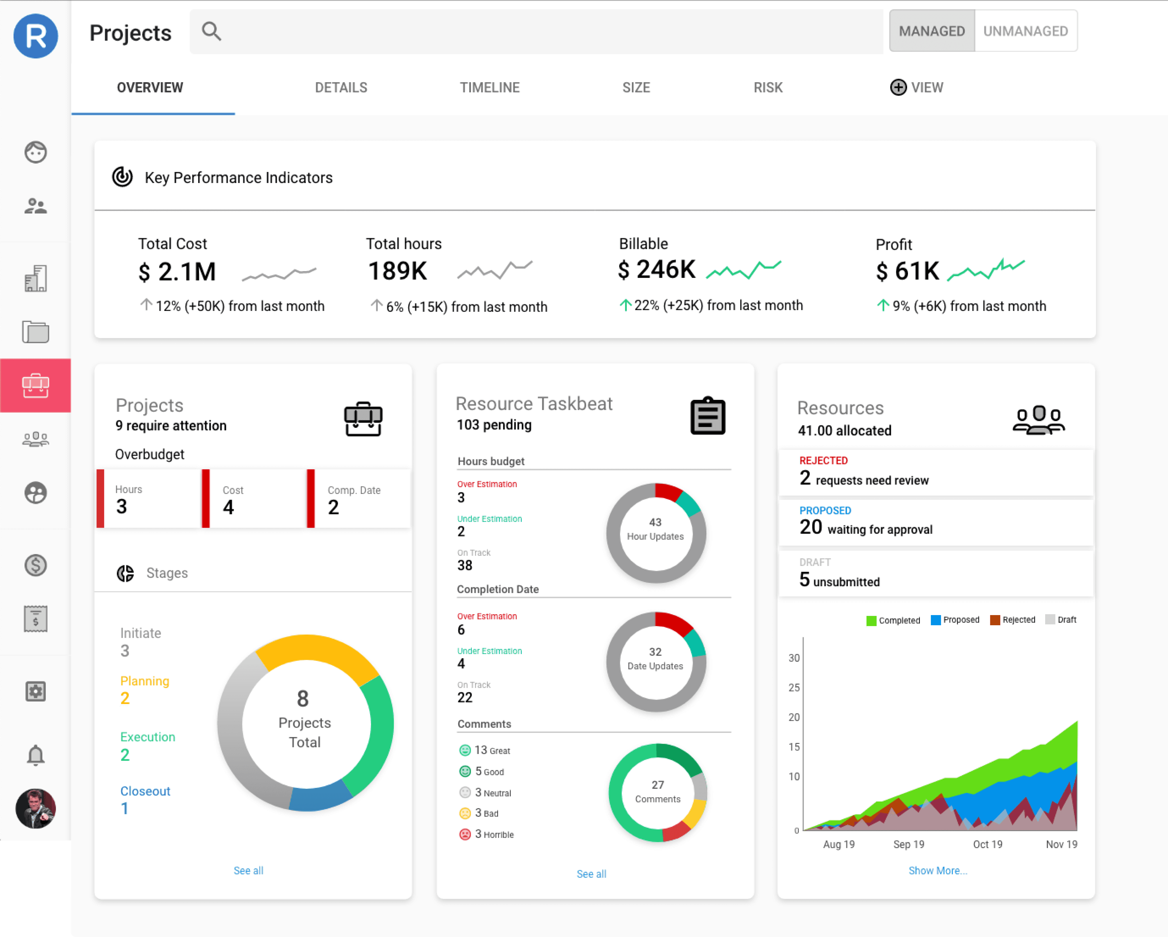
Simplify ruthlessly. There was too much data to consolidate on an overview, so I worked closely with our PMs to decide what the most important data points were that we could summarize and take action on.
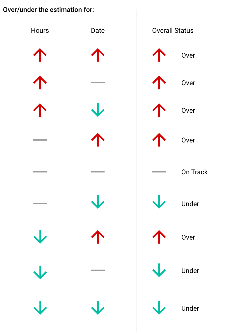
Encode judgment into the system. The trend lines and arrows (expanded below) on the KPI card meant every metric communicated direction at a glance without a legend. This gave PMs a starting point about how their projects were doing month to month.
Keep it legible. It was important for me to keep the graphics light and easy to understand quickly so that users weren't overwhelmed with the amount of data we were providing.
Outcome
• The design helped sell the product: It was used in sales demos and cited by prospects.
• Longevity: the design is still in the product today, six years on.