Sports Troll
UX overhaul and launch marketing for a social sports app, downloads and activity up 100%.
Overview
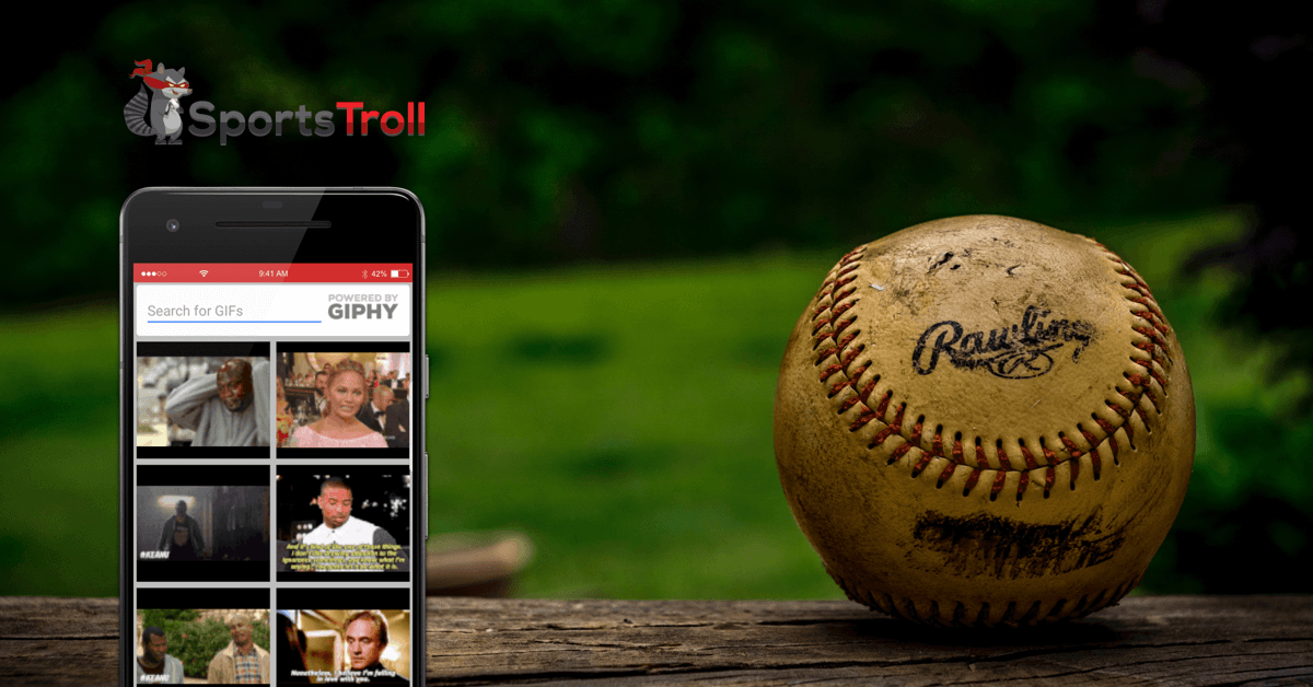
Sports Troll let sports fans do what sports fans do: talk trash. When a rival's team lost, the app notified you so you could send them a custom meme, all wired through Twitter. The founder had a working skeleton; I was brought in through HiroHaus to rebuild the user flow, UX, and visual design, and ended up also running social content, ad creative, and app-store presence. Another whole-design-department engagement, this time for a consumer social app.
The problem
The app's core loop - rival's team loses → you get notified → you troll - was buried in a confusing structure. There wasn't a clear explanation of what the app did, and for a niche app like this, that mattered.
Key decisions
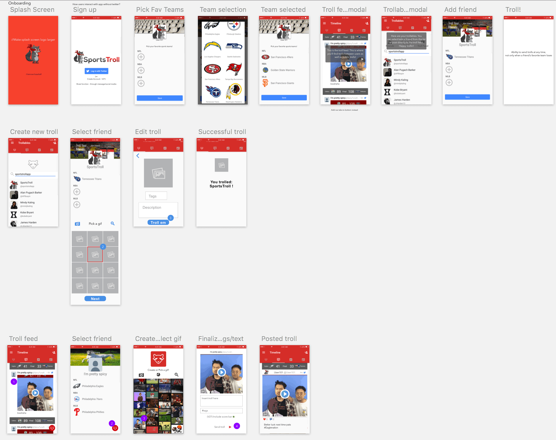
Redesign around the moment. The product's real trigger is external (a game result), not a user opening the app. I built the onboarding and the create-a-troll flow around getting from notification to sent meme in as few steps as possible.
"Troll Anywhere." I designed a bottom-corner FAB, visible anywhere in the app, that let users send a troll without waiting for a notification. That removed the dependency on game results entirely.
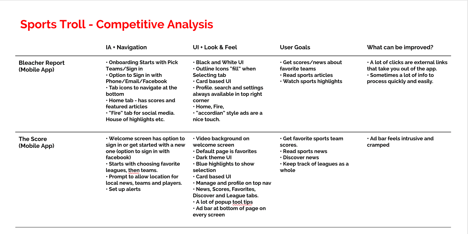
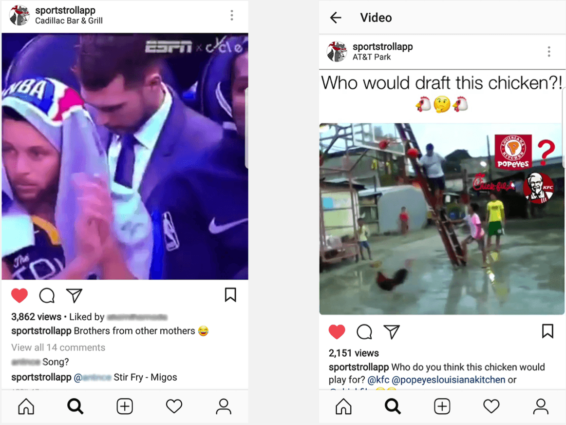
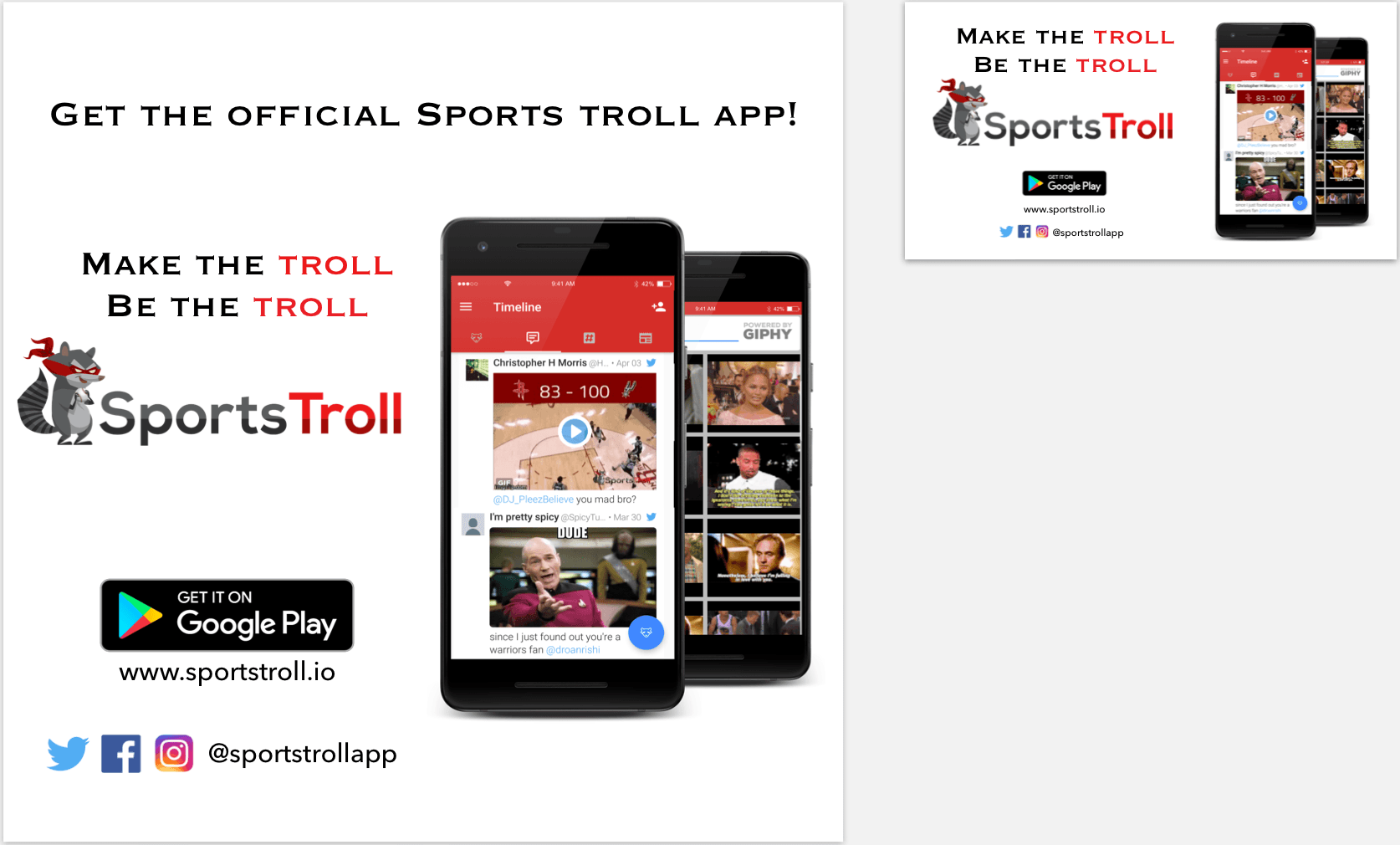
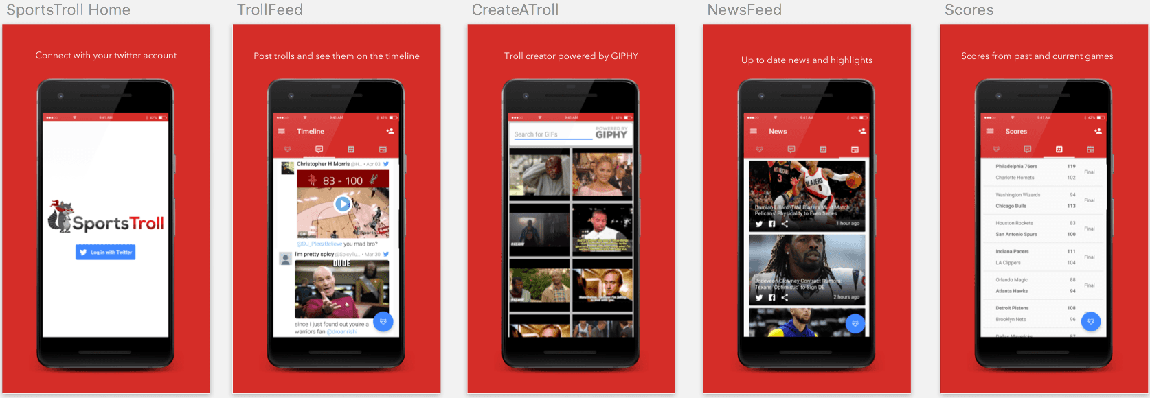
Design the whole funnel, not just the app. Downloads were the goal, so I extended the visual system outward: Instagram content, Facebook/IG ad creative with download links, and the app-store marketplace images, the first screens a potential user ever judged the app by.
Social media and ad content
Outcome
Downloads and in-app activity roughly doubled (+100%) following the redesign and content push. This was an early, scrappy launch; days after launch, we'd gone from 10 to 20 downloads with an upward trend, small in absolute terms, but the redesign was already changing the trajectory. The redesign AND the marketing together drove this.
How I'd build this with AI today
In 2018, every meme template, ad variant, and app-store image was hand-made. The same engagement today:
A working prototype of the notification → create-troll → send flow built in Lovable, testable with real users in week one instead of static wireframes.
Claude generating the content system: meme copy variants, ad headline tests, and edge cases for the trash-talk tone (what's funny vs. what gets the app flagged, a real content-design problem I'd now stress-test with a model before launch).
What wouldn't change: identifying that the game result, not the app open, is the real trigger moment. That's the same instinct behind Dela's contextual suggestions seven years later; the tools got faster, the judgment is the through-line.